
Overview
Healthcare app concept · UX/UI designer in a team of five · 12 weeks, 2025
We set out to fix waiting times. We ended up designing for clarity.
A concept app for a new private healthcare provider: one place to book care, see a doctor remotely and understand your own health.
Research was shared across the team. My focus was user journeys, UI design, the design system and prototyping.
Concept project. AlbaHealth is not a real healthcare provider.
The Problem
We thought the problem was waiting times. It wasn't.
-
What we assumed
The biggest frustration was speed: long waits and slow booking. A faster booking app looked like the answer.
-
What we heard
People didn't just feel frustrated. They felt overlooked and uncertain. Delays weren't the only issue: a lack of clarity and reassurance was.
"It's the struggle to try to get an appointment… once you have one and you go, I really never have any issue."
So we stopped designing for speed alone, and designed for clarity and trust.
The app in use
Booking, start to finish.
Pick a date, choose a doctor, confirm. No phone queue at 8am.
Research
We started with interviews, because healthcare is emotional, not just usable.
A survey could tell us how often booking went wrong, but not how it felt. So after each of us researched one area of healthcare (mine was women's health and femtech), we spoke to people directly.
-
Discover
6 interviews
12 questions on booking, care and managing health.
-
Define
Thematic analysis
Turned into personas and ranked requirements.
-
Structure
Card sort
6 people showed us what belonged where.
-
Review
Expert evaluation
A review of the final prototype.
What We Heard
People wanted clarity and reassurance, not just faster healthcare.
Four themes came up again and again in the interviews, in people's own words.
-

"…basically giving you a few leaflets and then kind of sending you away with that."
01
Medical information was hard to understand
Medical information and results weren't always explained in a way people could follow, so they were left unsure what it meant for them.
-

"It kind of just makes you feel like… you don't matter a little bit."
02
People wanted to feel heard and prioritised
Chasing call-backs and results, and repeating themselves to different people, left patients feeling like an afterthought in their own care.
-
"They sort of didn't reply to me for a long time, so I didn't know what was happening."
03
Next steps weren't clear
After booking or an appointment, people often didn't know what would happen next, or when they'd hear back.
-

"I've seen myself phone up to 80 times to be able to get through."
04
Getting an appointment was hard work
Phoning at 8am, again and again, often to hear there were no appointments left, and taking time out of work to do it.
Priorities
We cut the doctor's side to do the patient side properly.
A real healthcare system needs separate portals for patients, GPs and clinic staff, each seeing different information. We'd planned to design both sides, but the doctor's side needed its own interviews, requirements and wireframes. In 12 weeks, that would have stretched everything thin.
So we designed for patients. Within the brief (unified services, remote access, patient education, wider reach and trust), we focused on the moments where uncertainty was highest:
- 01 Booking an appointment
- 02 Understanding results
- 03 Seeing a doctor remotely
- 04 Tracking the care journey
Iterations
Paper, lo-fi, mid-weight, then final.
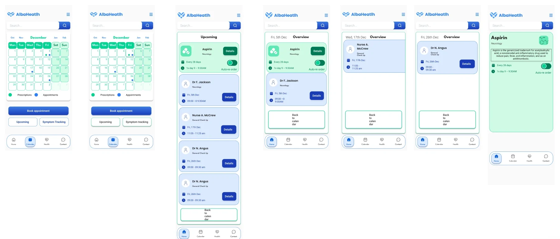
We sketched over 100 paper screens to flesh out the flows, then built lo-fi wireframes. Each of us designed our own take on the key tasks. Side by side, it was clear which ideas worked: we kept those, dropped the rest, and refined them through two more rounds before the final design.
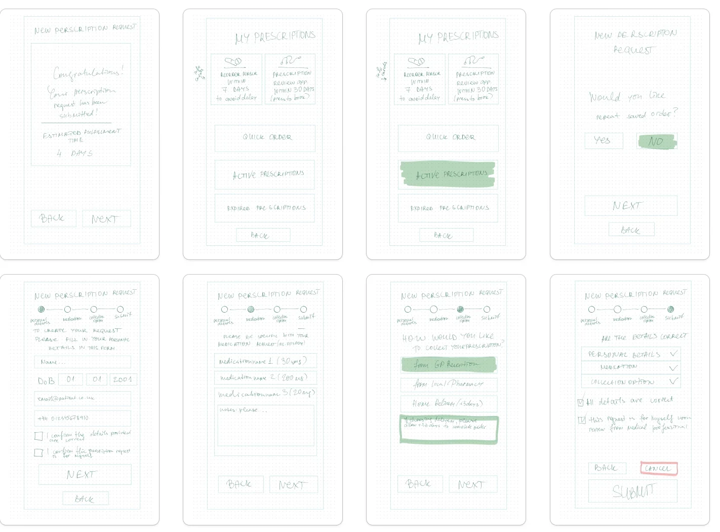
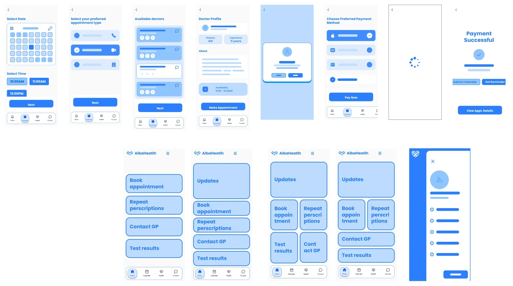
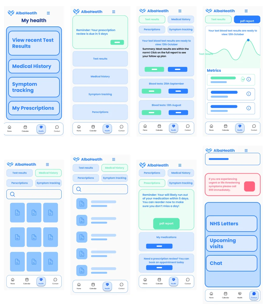
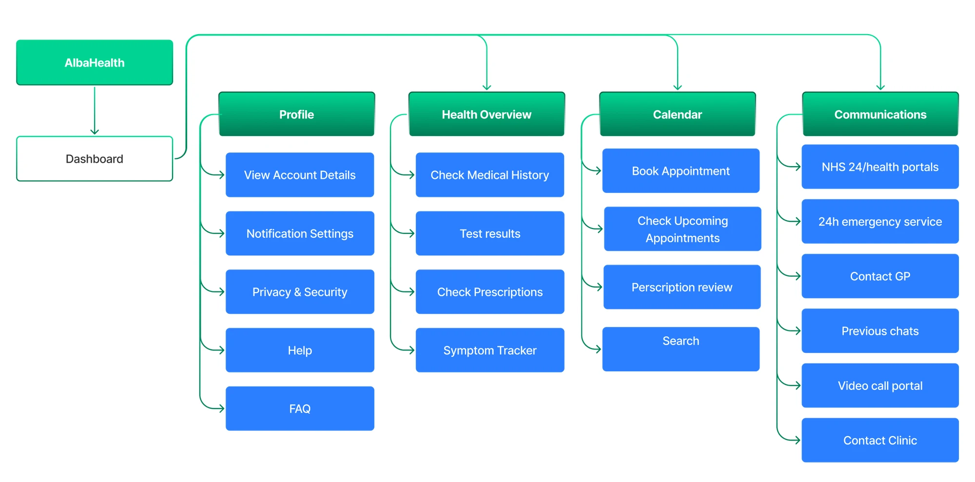
The card sort sharpened each section. It showed us what people expected to find in each part of the app, and we built the structure around it: four sections, each holding the tasks people expected to find there.
| Task | Communications | Calendar | Health Overview | Profile |
|---|---|---|---|---|
| Check Upcoming Appointments | 0 of 6 in Communications | 6 of 6 in Calendar | 0 of 6 in Health Overview | 0 of 6 in Profile |
| Book Appointment | 0 of 6 in Communications | 5 of 6 in Calendar | 0 of 6 in Health Overview | 1 of 6 in Profile |
| View Calendar | 0 of 6 in Communications | 4 of 6 in Calendar | 0 of 6 in Health Overview | 2 of 6 in Profile |
| Contact Customer Services | 5 of 6 in Communications | 1 of 6 in Calendar | 0 of 6 in Health Overview | 0 of 6 in Profile |
| View Previous Chats | 5 of 6 in Communications | 0 of 6 in Calendar | 0 of 6 in Health Overview | 1 of 6 in Profile |
| Report Error | 4 of 6 in Communications | 0 of 6 in Calendar | 0 of 6 in Health Overview | 1 of 6 in Profile |
| Misc Help | 4 of 6 in Communications | 0 of 6 in Calendar | 0 of 6 in Health Overview | 1 of 6 in Profile |
| Go to Video Call Portal | 4 of 6 in Communications | 2 of 6 in Calendar | 0 of 6 in Health Overview | 0 of 6 in Profile |
| NHS 24 Hour Portal | 4 of 6 in Communications | 0 of 6 in Calendar | 2 of 6 in Health Overview | 0 of 6 in Profile |
| Contact GP | 3 of 6 in Communications | 2 of 6 in Calendar | 1 of 6 in Health Overview | 0 of 6 in Profile |
| Test Results | 0 of 6 in Communications | 0 of 6 in Calendar | 5 of 6 in Health Overview | 1 of 6 in Profile |
| Request Prescription | 1 of 6 in Communications | 0 of 6 in Calendar | 5 of 6 in Health Overview | 0 of 6 in Profile |
| Prescription | 0 of 6 in Communications | 0 of 6 in Calendar | 5 of 6 in Health Overview | 1 of 6 in Profile |
| Record Symptom | 0 of 6 in Communications | 1 of 6 in Calendar | 4 of 6 in Health Overview | 0 of 6 in Profile |
| View Medical History | 0 of 6 in Communications | 0 of 6 in Calendar | 4 of 6 in Health Overview | 2 of 6 in Profile |
| View Account Details | 0 of 6 in Communications | 0 of 6 in Calendar | 0 of 6 in Health Overview | 6 of 6 in Profile |
| Change Payment Details | 0 of 6 in Communications | 0 of 6 in Calendar | 0 of 6 in Health Overview | 6 of 6 in Profile |
| Privacy and Security | 1 of 6 in Communications | 0 of 6 in Calendar | 0 of 6 in Health Overview | 5 of 6 in Profile |
| Change Contact Details | 1 of 6 in Communications | 0 of 6 in Calendar | 0 of 6 in Health Overview | 5 of 6 in Profile |
| Notification Settings | 1 of 6 in Communications | 0 of 6 in Calendar | 0 of 6 in Health Overview | 5 of 6 in Profile |
| Search for Information | 2 of 6 in Communications | 0 of 6 in Calendar | 1 of 6 in Health Overview | 3 of 6 in Profile |
Darker means more of the 6 participants · outlined: most common choice
Suggested by participants: Prescription reminders A map of where the appointment is Feedback on a clinic
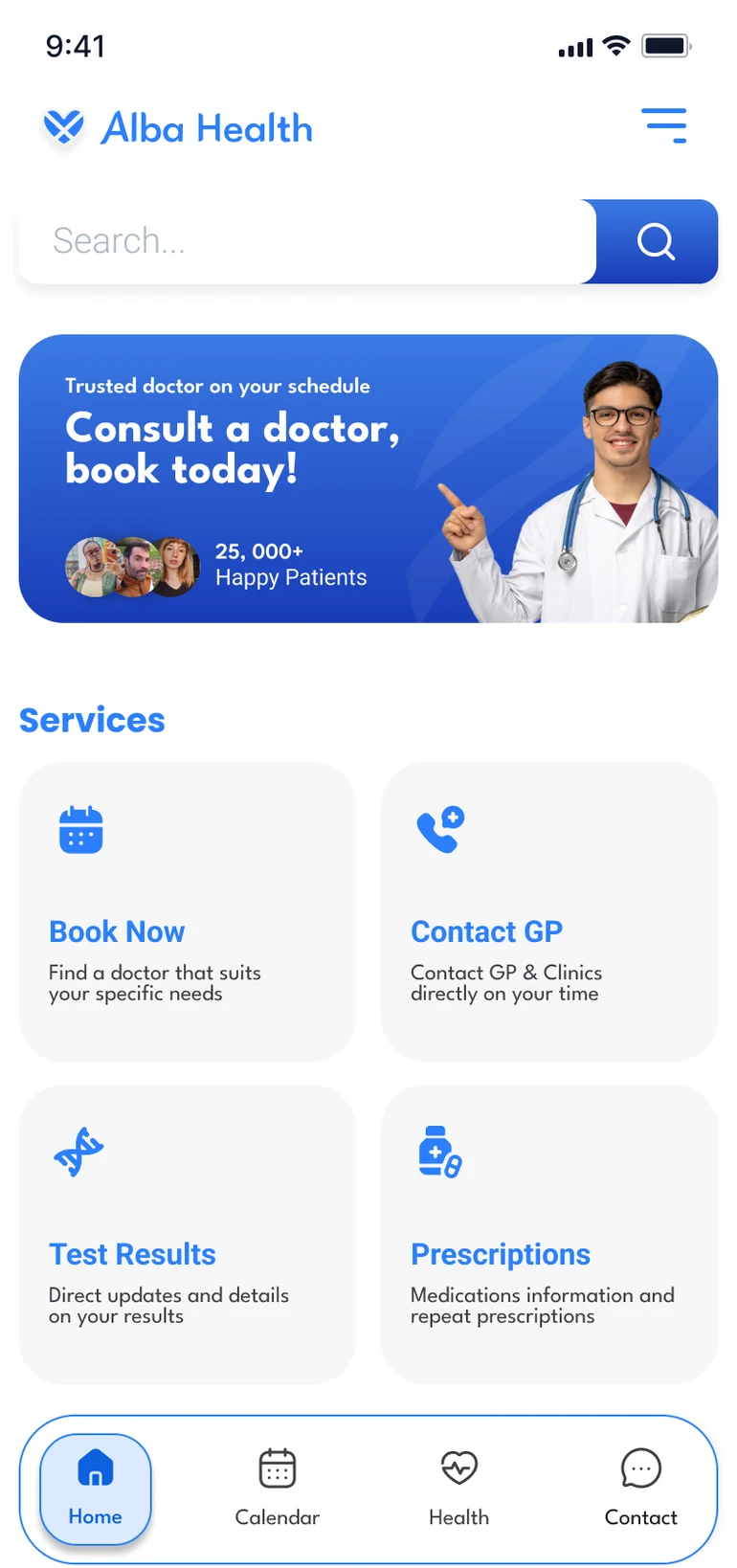
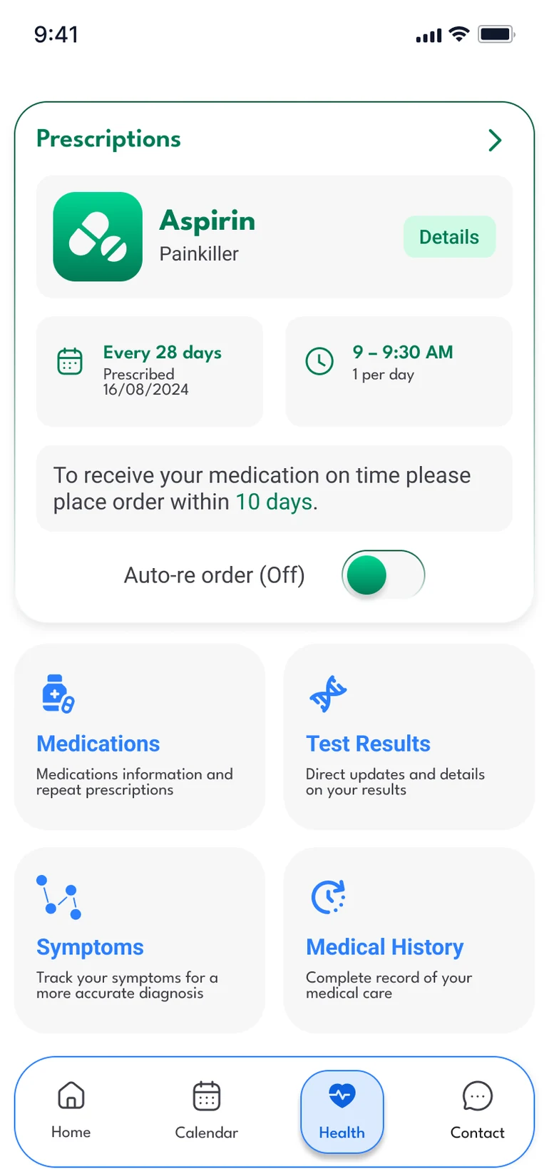
Colour had to mean something. Blue for the calm feel of a clinic. Green only for medication, so prescriptions never look like buttons or appointments.
Accessibility wasn't optional. We studied Apple's guidelines for familiar iPhone patterns, and the Scottish Government's design system, which treats accessibility as a requirement.
Weekly critique shaped the final screens. We commented directly on each other's designs every week, and worked through the comments before signing anything off.
Final Design
Simple, clear and in your control.
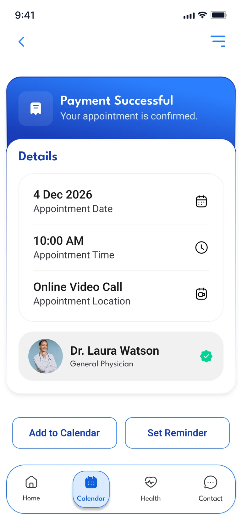
We simplified navigation and wording, and made the next step clear at the end of each journey.
01
A clear, all-in-one view of your care
Home and Health bring the main services together, each explained in one line of plain English.
02
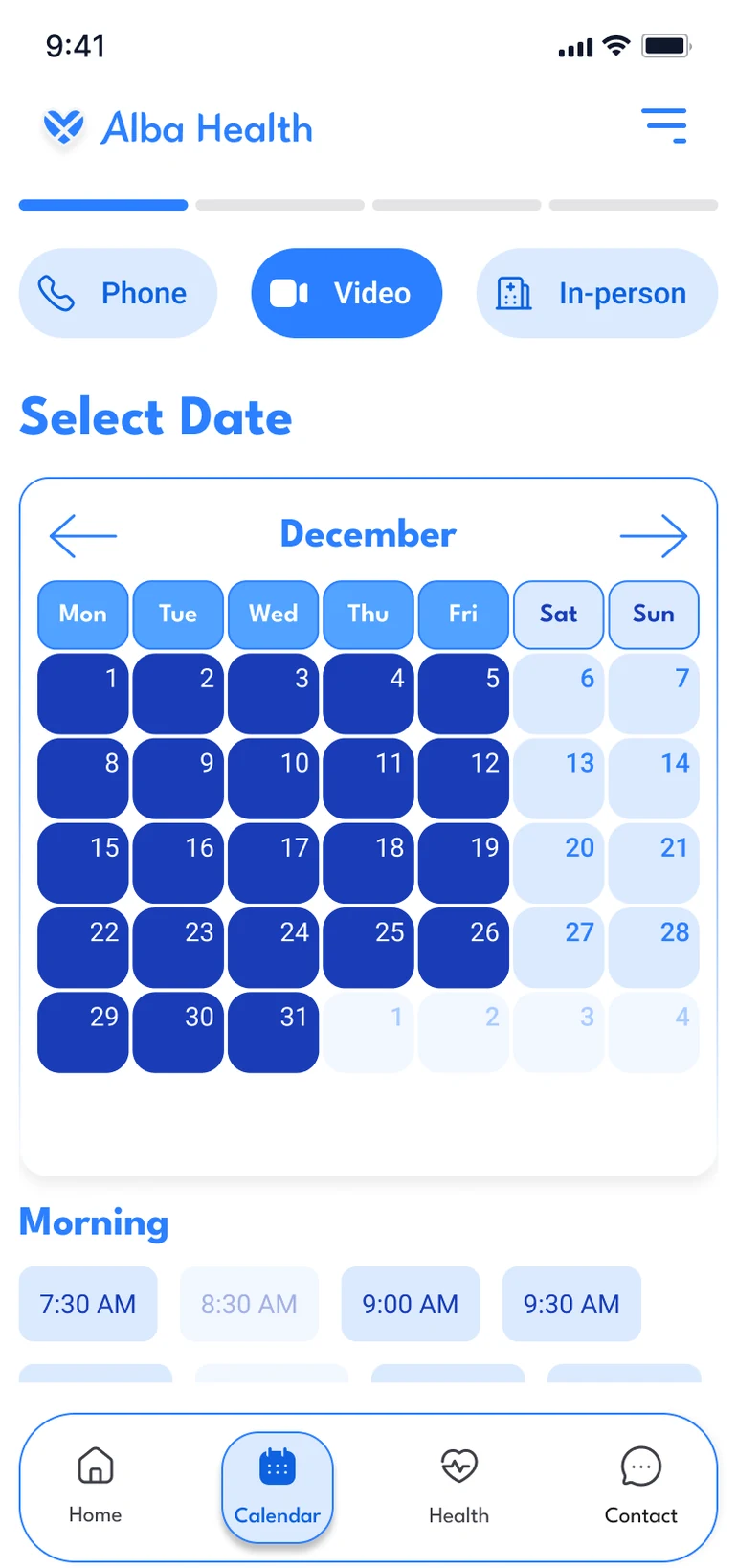
Book appointments around your schedule
Booking is split into short steps with a progress bar, so people always know how far along they are.
Choose how and when: phone, video or in person, then a date and time.
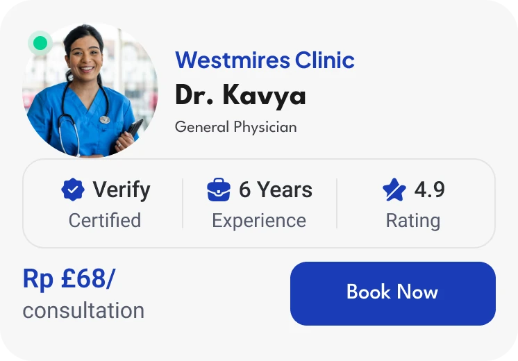
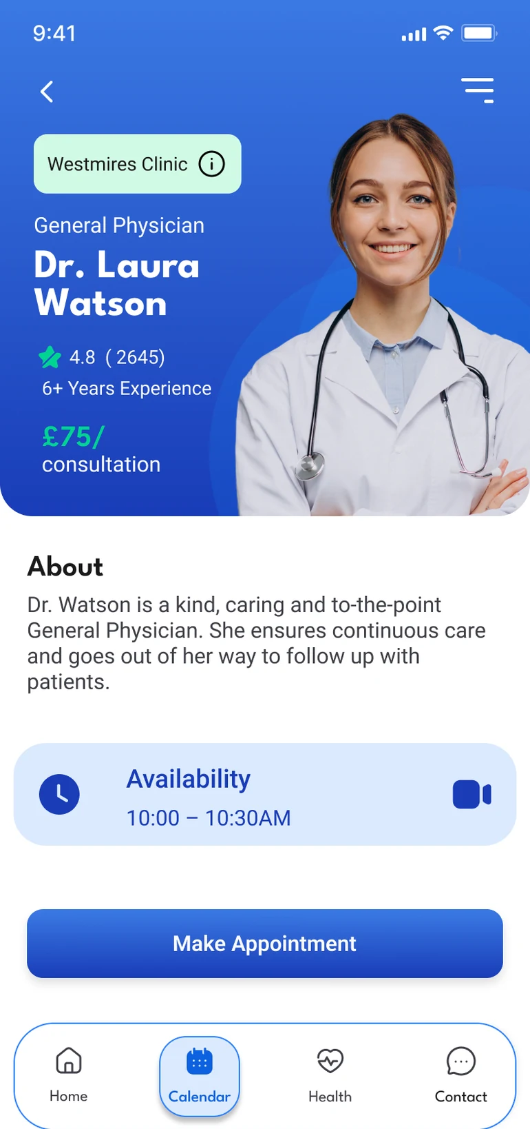
Doctor cards show clinic, experience, rating and price at a glance, so people can compare before they book.
03
Prescriptions, without the phone call
Repeat prescriptions take a few taps, and the app says what happens next.
Every medication in green, so it never gets confused with buttons or appointments.
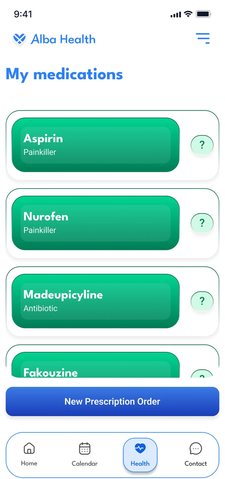
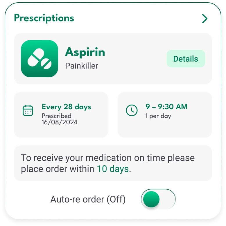
Reorder reminders show when each prescription is due, with the option to reorder automatically.
Quick add reorders past medication in one tap.
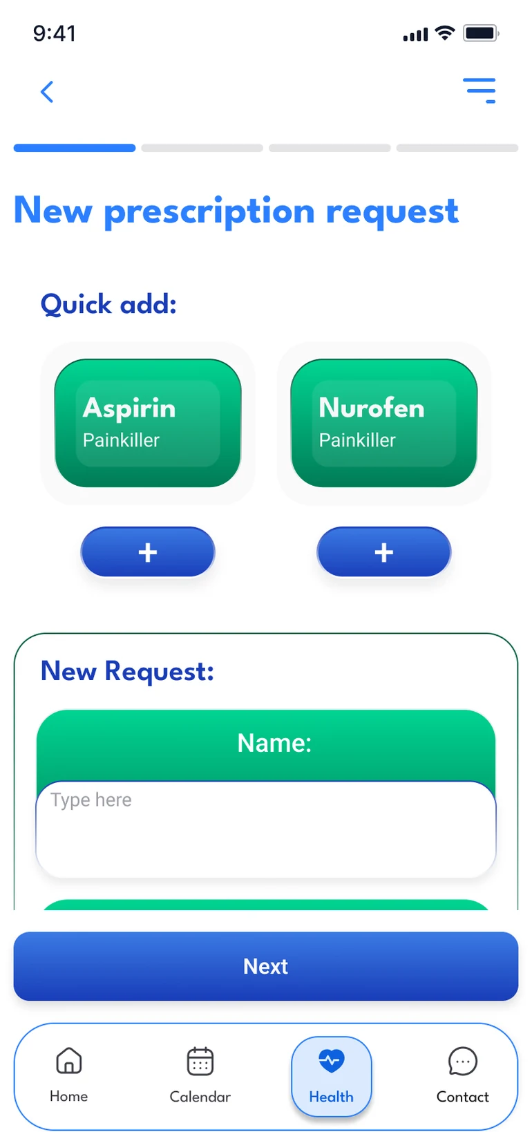
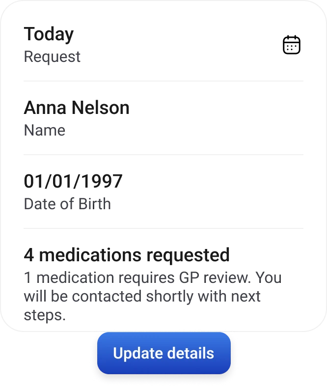
No surprises: a final check before ordering, and a plain note when a medication needs GP review.
04
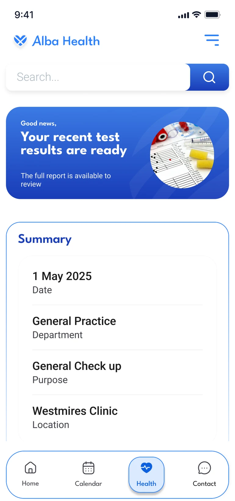
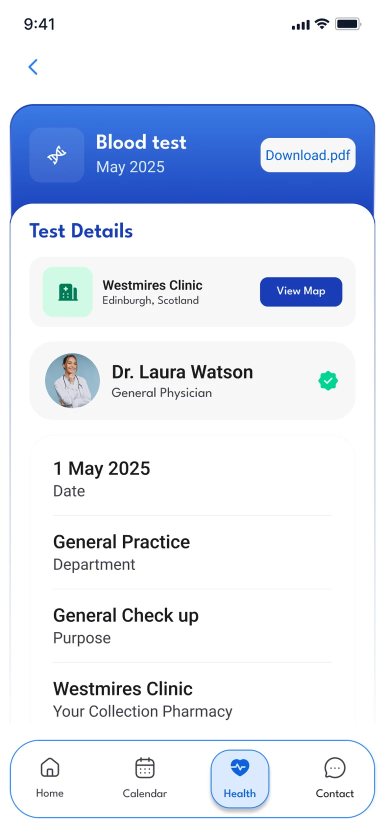
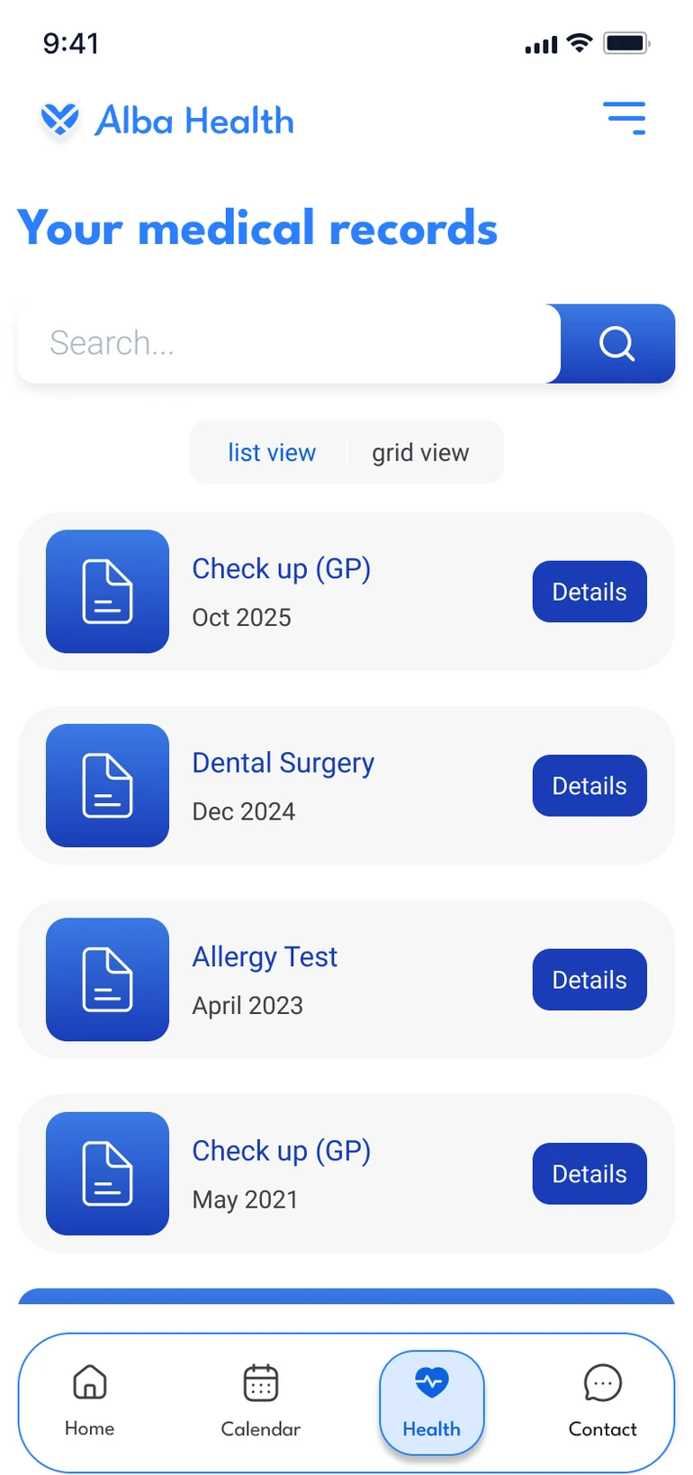
Your medical history, all in one place
Results and records are easy to find, and say what they are in plain words.
05
Connect with your GP, without the wait
Patients can reach their practice on their own time, instead of phoning first thing in the morning.
Your practice in one tab: book, find GP details or request a prescription, with the clinic on a map.
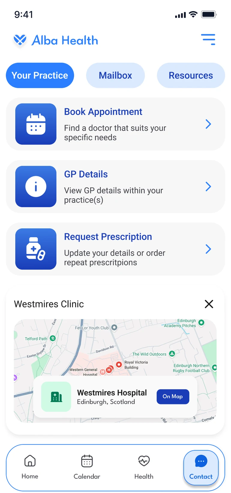
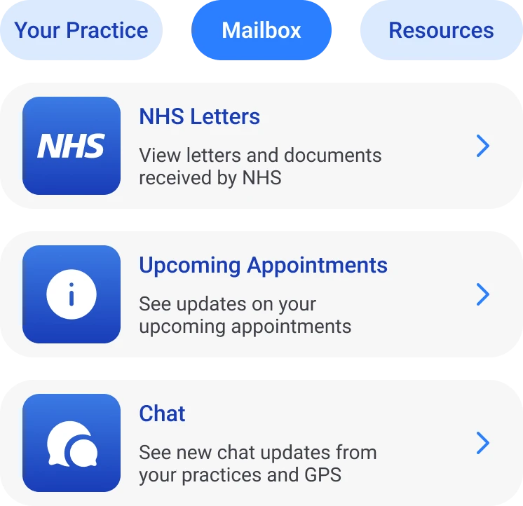
One mailbox for letters, appointment updates and chat with your practice.
06
UI kit
The building blocks behind every screen, from the app's own design system.
Typography
League Spartan
Headings · Bold and Semi Bold
Roboto
Body text · Light, Regular and Medium
Colour
- BlueBrand, buttons, calendar
#2B7FFF - Dark blueText and borders
#193CB8 - GreenMedication only
#00D492 - Dark greenBorders and text
#007A55
Buttons


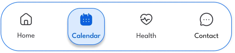
Navigation

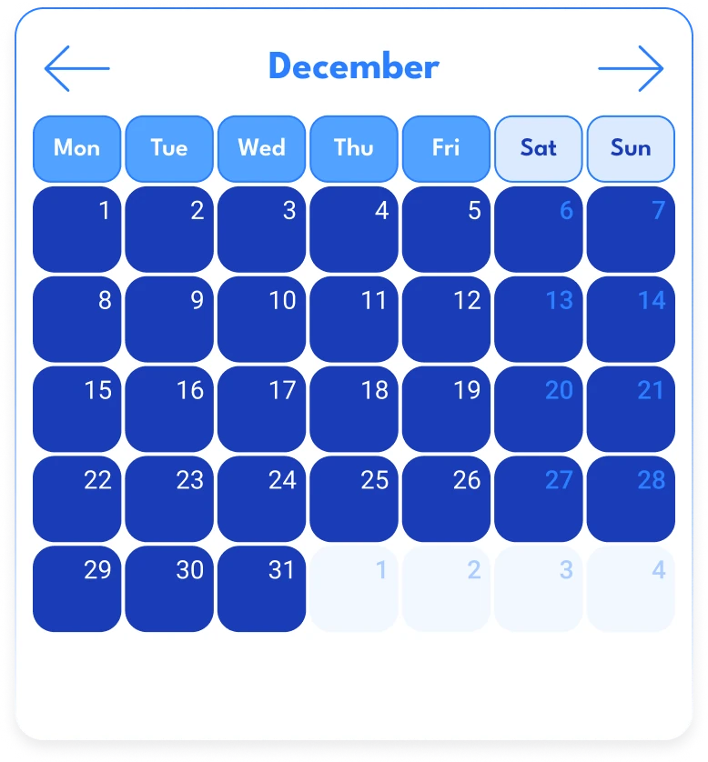
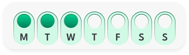
Calendar
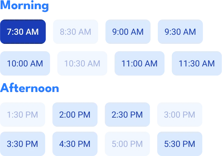
Time
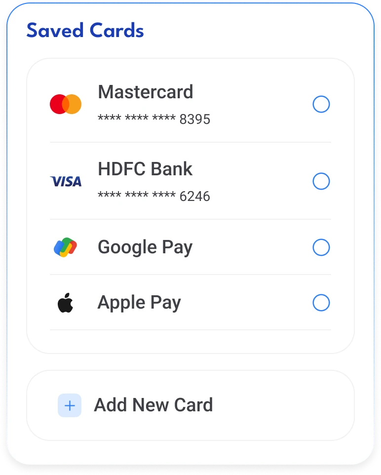
Payment
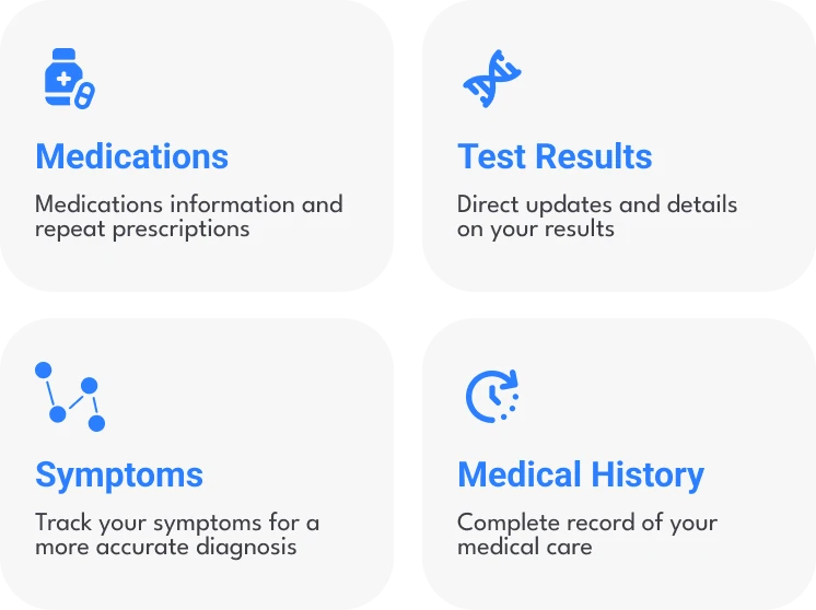
Medication

Elements
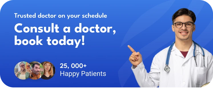

Words mattered as much as screens. We avoided medical jargon and wrote in plain, approachable language. In a company this might be a dedicated team's job; here, it was our call.
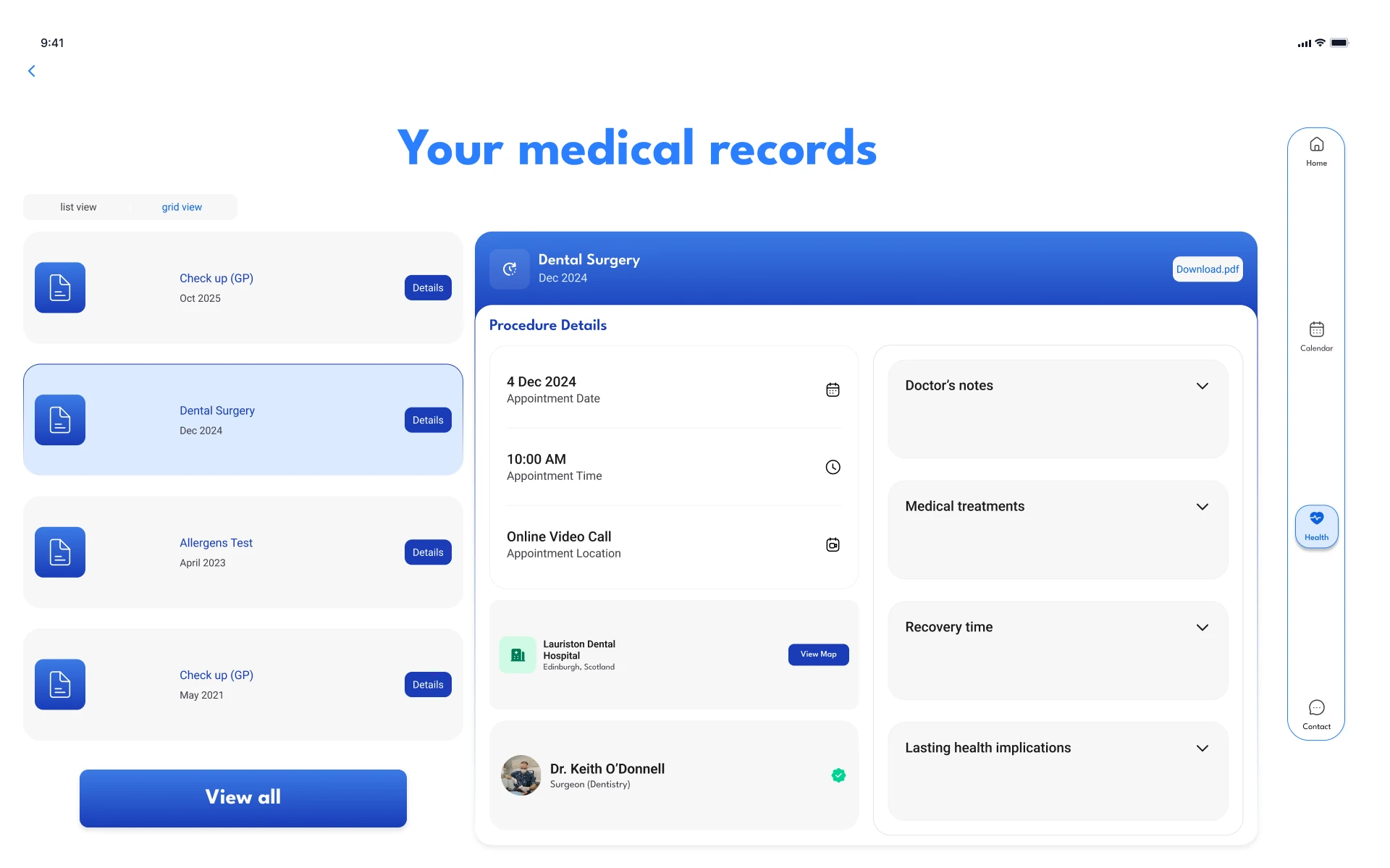
It works on tablet too. We adapted the phone designs for tablet. There are fewer tablet screens than phone ones, but we took them as far as time allowed.
Tablet
The same app, scaled up for iPad.
Built on the same 4 × 6 grid and components, so every screen could adapt.
Next Steps
Next, we'd test it with patients.
We ran out of time for usability testing. It's the first thing I'd do, to find out:
-
01 · Information
Could they find what they needed?
Did each screen have what people were looking for?
-
02 · Ease
Was it simple to use?
Were booking and the other journeys easy to follow?
-
03 · Gaps
What's missing?
Where did people get stuck, and what would they add?
We'd also test with a wider range of ages, and develop messaging and symptom tracking further.
Reflection
What I took from it.
Talk to people before you define the problem. Our first assumption was wrong. The interviews turned a speed problem into a clarity problem.
Cutting scope is a design decision. Dropping the doctor's side gave the patient journeys the time they needed.
In healthcare, clarity builds trust. Not everyone is confident with technology. Plain language and obvious next steps help people manage their care on their own.
Test earlier. Without usability testing, we couldn't prove the designs worked. Next time, I'd put a rough prototype in front of users much sooner.
Thanks for reading
Hanna