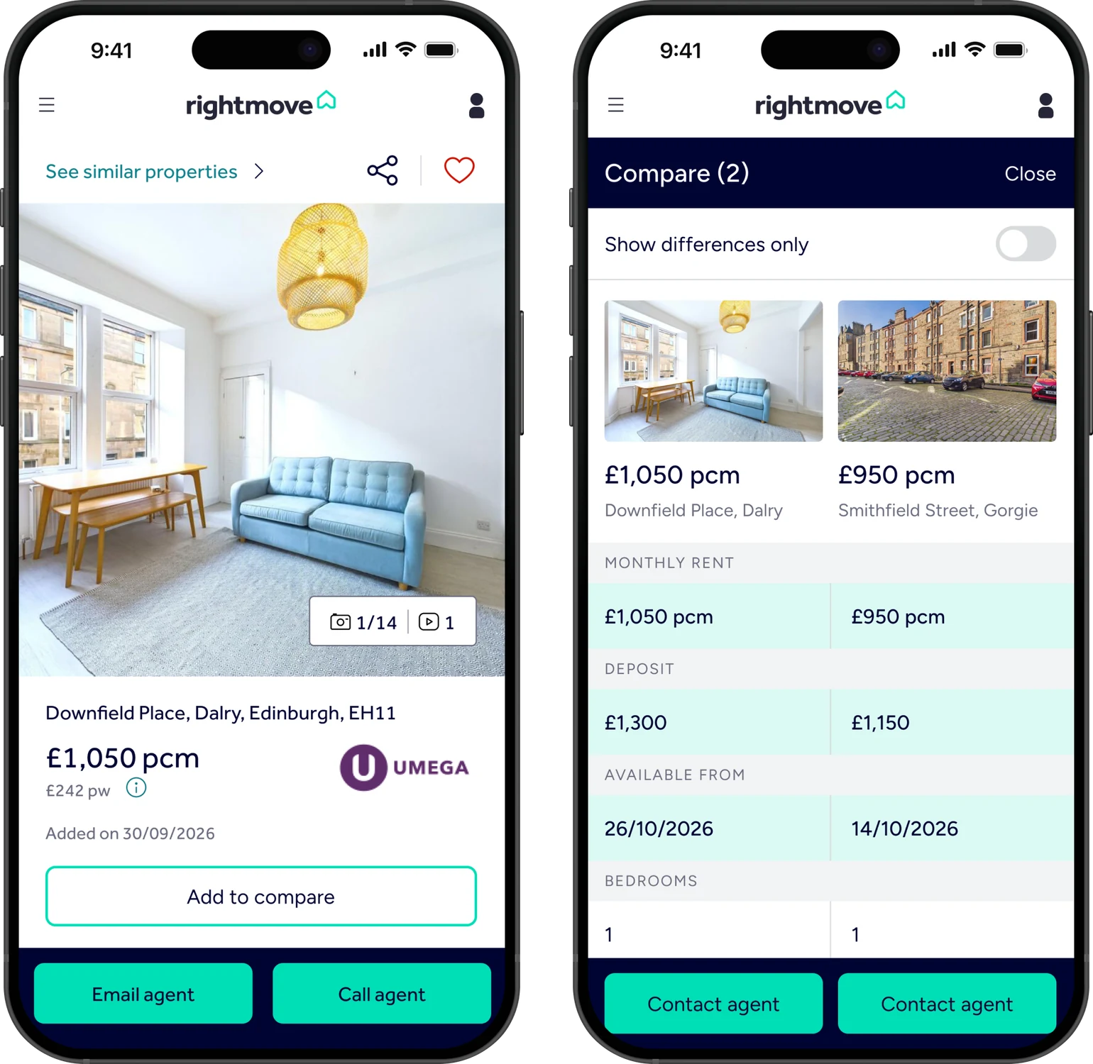
Overview
Rightmove is one of the UK's largest property platforms. I explored where the experience creates friction for renters making high-stakes decisions, then designed three improvements around what I found.
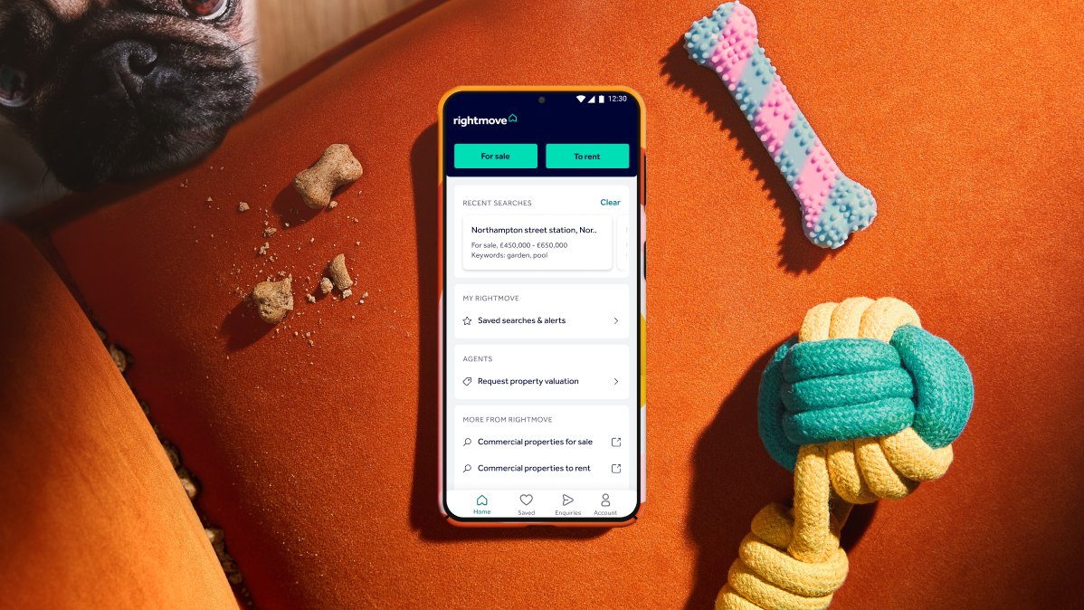
The Problem
Finding a property wasn't the problem. Feeling confident enough to choose one was.
Rightmove's core search experience worked well, but my research uncovered friction at the point of decision: unclear listing information, hard-to-find filters, and no direct way to compare properties.
For a high-stakes decision, those small gaps quickly became trust problems.
Research Process
I wanted to observe behaviour, not just ask about it.
I chose task-based usability testing with a think-aloud protocol to see where friction appeared during a realistic property search.
-
Participants
5
All had used property platforms before.
-
Core task
1
Everyone did the same task, so I could compare sessions.
-
Usability testing
Think-aloud
To see what people do, not what they say they do.
-
Synthesis
Affinity mapping
To pull out what kept coming up.
Five participants with previous experience using property platforms were asked to find a one-bedroom rental in Edinburgh, compare their options and talk through what mattered before deciding.
I recorded and transcribed each session, then used affinity mapping to identify recurring patterns.
What I Found
What's already working
Participants navigated Rightmove easily and completed the core search task without difficulty. The problem wasn't finding properties. It was evaluating them.
01
Important information was unclear or missing
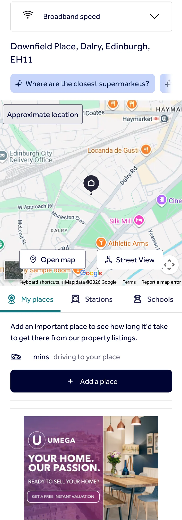
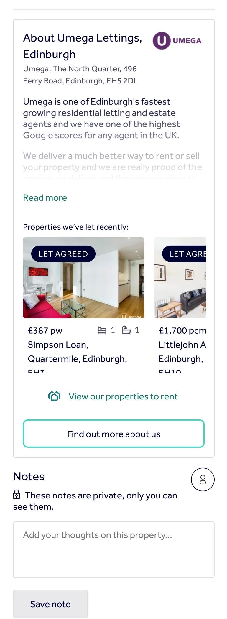
Floor plans, floor level, property type and pet policies weren't consistently clear, making some listings harder to trust.

"No floor plan… I don't trust that."

"Pets considered… I don't really know what that means."
02
Finding basic controls took too long
Participants often had to dig through listings or leave Rightmove entirely to find information they expected to see immediately.
This became particularly clear when trying to exclude flat shares: the option existed, but was buried at the bottom of a collapsed filter panel.
03
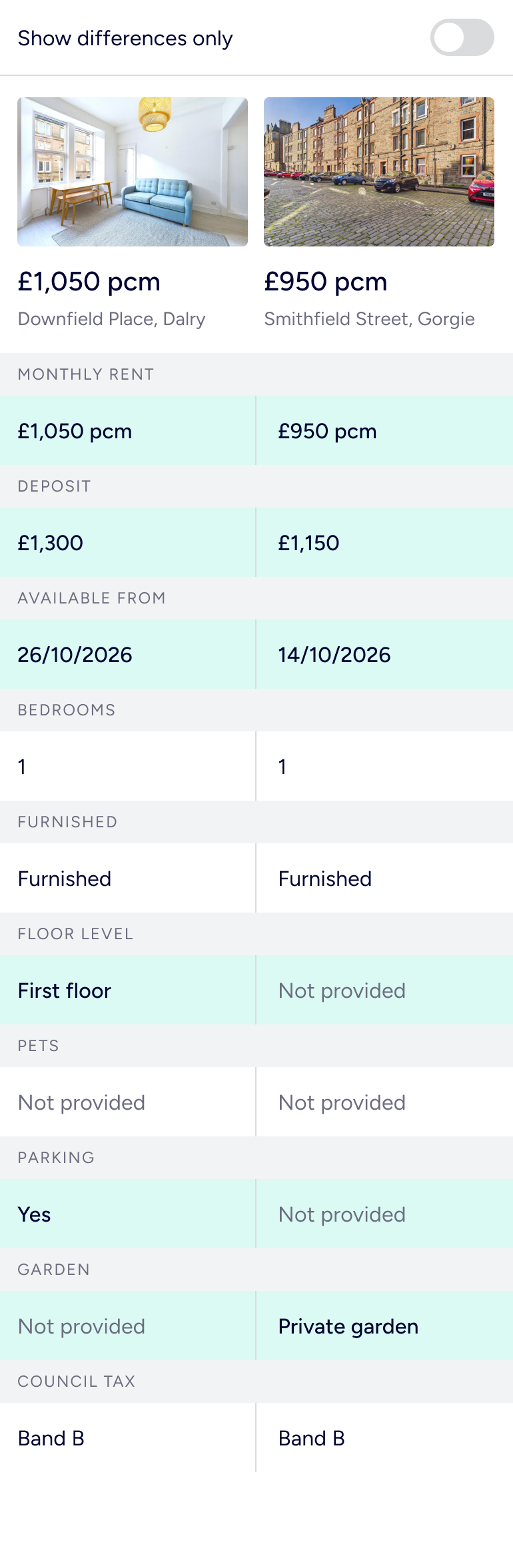
Comparing properties relied on memory
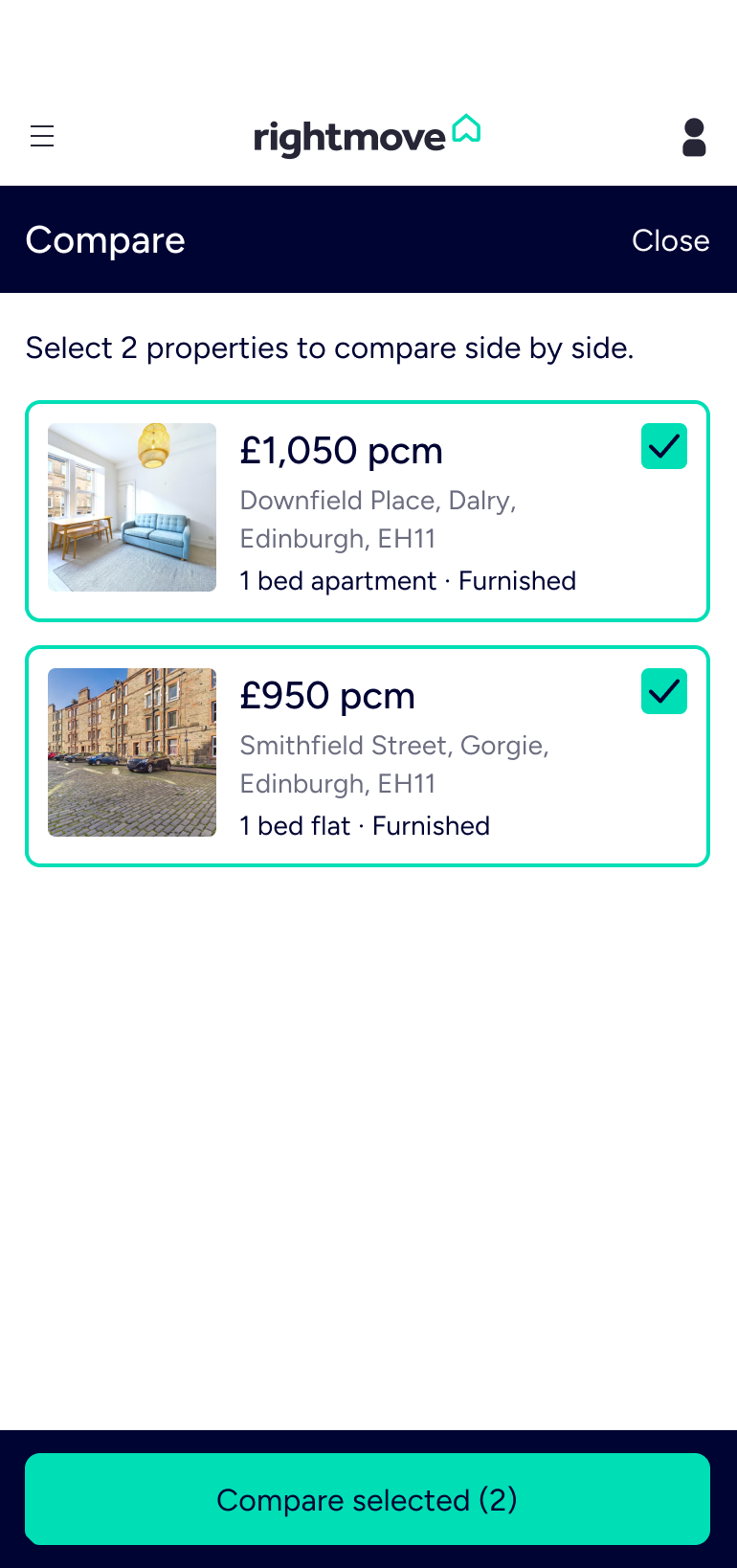
Participants saved multiple properties, but had no way to compare them directly.
On mobile, that meant repeatedly switching between listings and remembering the differences rather than seeing them side by side.

"I don't know if there's a way to compare them directly… that would be very cool."
Designing the Fix
Three findings. Three targeted changes.
01
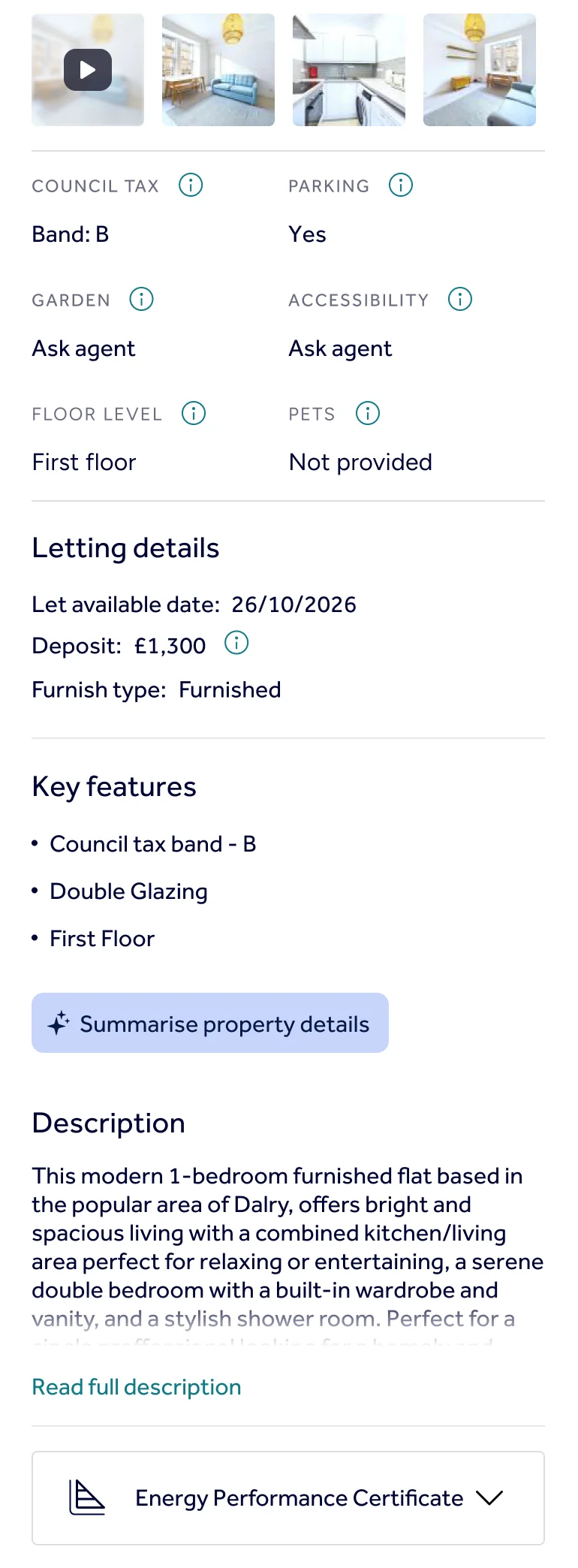
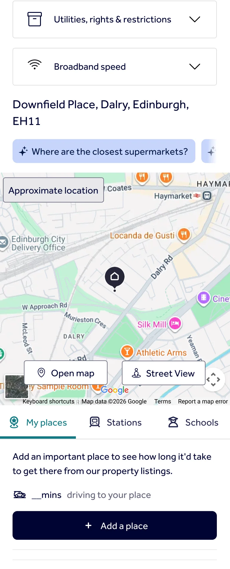
Make listing details explicit
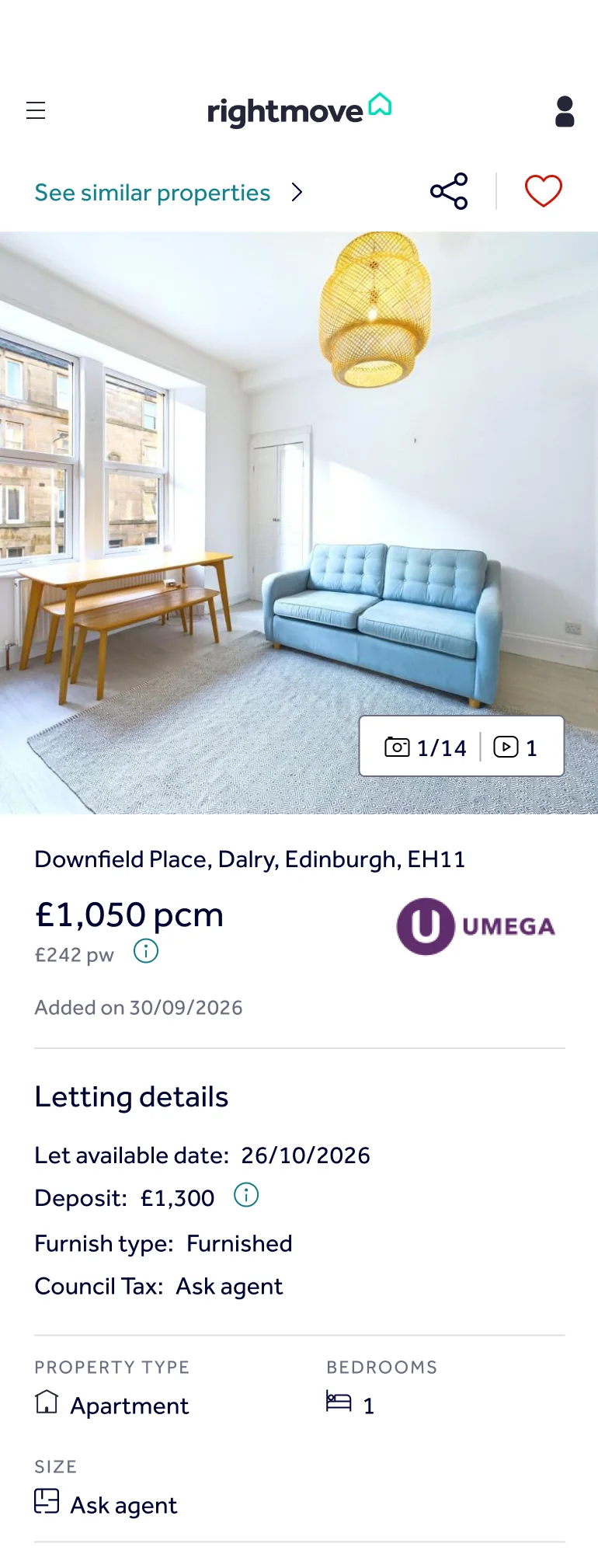
Before
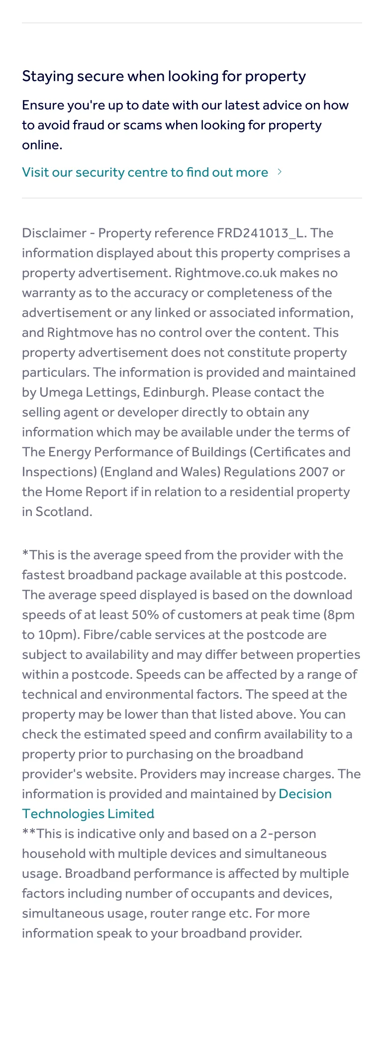
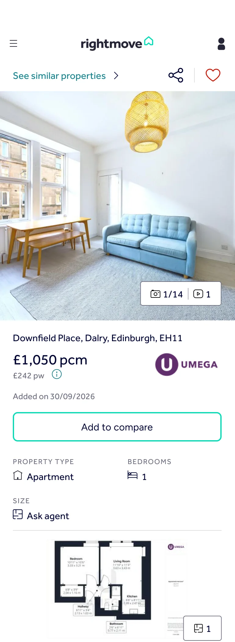
Floor plans, floor level and pet policy were missing or vague, which made listings harder to trust.
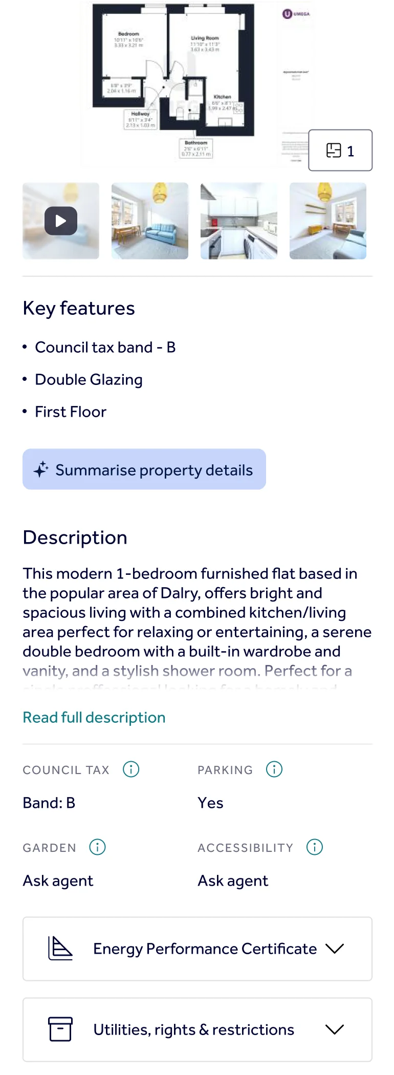

After
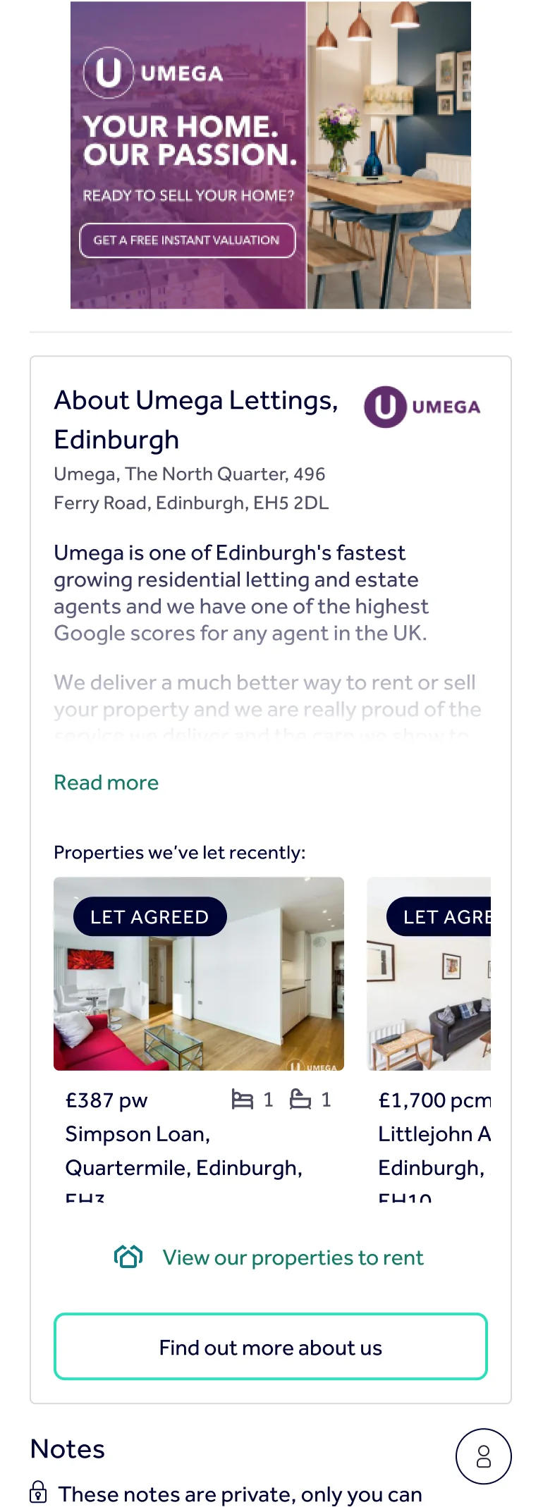
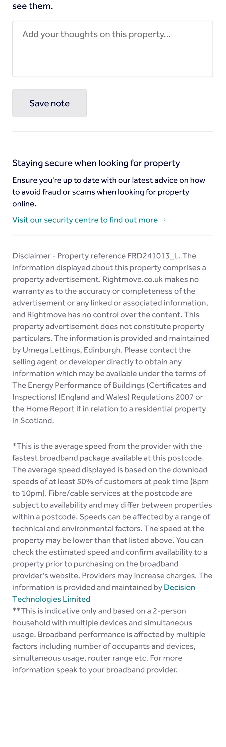
I made a floor plan the default and pulled floor level and pet policy into a clear info grid, replacing vague labels.
02
Surface the filters people actually need
Before
The option to exclude flat shares sat in the last section of the filter panel, collapsed by default.
- Flat shares can only be excluded under "Don't show", at the very bottom.


After
I moved "Don't show" up from the bottom of the panel to sit straight after the basics, so hiding flat shares no longer means scrolling past everything else.
- "Don't show" is now sixth, right after the filters people set first.
- Less-used filters move to the end.


03
Let people compare, not remember
I designed a mobile-first comparison tool for saved properties, highlighting the fields that differ so users can evaluate options side by side instead of switching back and forth.


Success Metrics
How I'd know the changes worked.
These are what I'd measure, not results. Each change has one measure, tied to the problem it was meant to fix.
-
01 · Listing details
Time to find key details
If floor level and pet policy take seconds to find, the info grid is working.
-
02 · Filters
First-attempt success
If people can exclude flat shares without hunting, the filter is in the right place.
-
03 · Comparison
Comparison adoption
If people with saved properties compare them side by side, it's replacing memory.
The business measure behind all three is enquiries sent to agents. Clearer listings might mean fewer enquiries but more serious ones, so I wouldn't judge it on numbers alone. I'd ask agents whether the enquiries they got were better.
Reflection
What I took from this.
Even well-established platforms have friction. People could use Rightmove without difficulty, but it still didn't meet all of their needs. The gaps were in the details: content, information architecture, and the features people were looking for. It reminded me to look closely, even at products that seem to work.
Not every UX problem is an interface problem. Some of those details might be missing because agents don't supply them, not because the page hides them. Agents are also Rightmove's paying customers, so any solution would need to balance what they need with what users need.
With more time, I'd test the three redesigns with new participants, starting with the filter change because it's the smallest to build and the easiest to measure. I'd also speak to agents directly to understand what they can and can't include on a listing.
Thanks for reading
Hanna